UX Writing Matters. Take It from This Frustrating Experience.
Pinterest abruptly deactivated my account last week.
My brain has a tendency to turn to mush whenever I need to make decisions about anything visual, and Pinterest has always been helpful for helping me sort my thoughts and get a better sense of what I like and don’t like.
Over the past decade-plus, I’ve used Pinterest to help me zero in on things like: logos and color palettes, my wedding bouquet, website layouts, nail art, jewelry, home decor, and more.
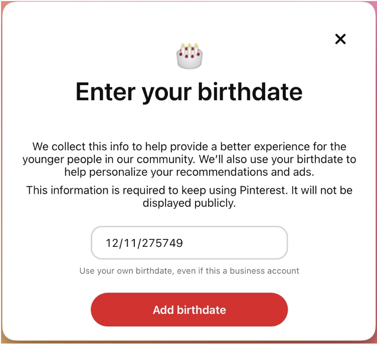
But last week when I opened the Pinterest app on my phone, a little notification popped up asking me to set my birthdate. I’m not a fan of giving my birthdate to apps, especially ones that I only use sporadically and that don’t give me a really, really good reason for sharing it. (In the US, your birthdate can be used to steal your social security number and identity fairly easily.)
Pinterest’s notification talked mostly about “a better experience for the younger people in our community” (not me) and personalizing “recommendations and ads” (not something I’m interested in). It mentioned that I should enter my personal birthdate even for a business account, and the date picker let me pick any date, even today’s date.
(I didn’t take a screenshot, but I was able to find the desktop version on Twitter.)
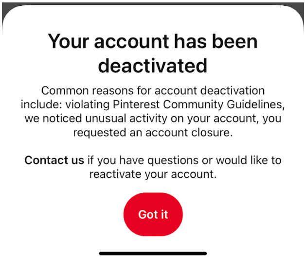
At this point, I really didn’t understand why I needed to enter my birthdate or what I would get out of it, so I selected a random date. Within seconds, I got a message saying that my account had been deactivated for ambiguous reasons. (Sure, I probably should have assumed that there was a minimum age for using the platform, but I didn’t think much of it considering the date picker started at the present date, in March 2023.)
I tried logging in on my computer and got a similarly ambiguous message that told me to contact them but didn’t indicate how.
It was only when I checked my email that I understood two things:
My account had been deactivated (immediately!) because Pinterest determined that I was underage.
To undo this, I would have to submit an appeal via Pinterest’s website using my government ID or birth certificate. For account verification, Pinterest uses a third party called Jumio (which says, on its first page, “By clicking ‘Start’ you consent to Jumio collecting and disclosing your biometric data pursuant to its Privacy Policy.”).
Two issues:
In all of those pop-ups, Pinterest never told me that there was a minimum age and that anyone younger would immediately have their account deactivated.
Most of the online products I use daily (e.g., Gmail, Slack, Dropbox) don’t have access to my government ID—so why should I give it to Pinterest?!
So what does all of this have to do with UX writing?
Well, for one thing, this whole kerfuffle could have been avoided by simply communicating the age issue clearly—when they asked for my age and then when they told me that my account had been deactivated. Notice how they didn’t mention a minimum age in either case.
Here’s what we UX writers can learn from this:
1. Users want value—less fluff, more facts.
Too many products rely on phrasing like “a better experience.” What does that mean in the context of a product where you can save pictures and links? What does that mean in the context of any product?
I’ll admit: as the daughter of two computer science professors, I’m more wary than most users when it comes to anything related to security and privacy. Still, “a better experience” is a lazy copout—it doesn’t say anything to users, especially the skeptics like me. I think it’s in the interest of all users to say it like it is—something like: “We collect this info to make sure you’re over the age of 14 and show you age-appropriate content, recommendations, and ads.”
And if they need/want to avoid naming their minimum age (because younger users will then enter a fake date…?), they could go with, “We collect this info to make sure you’re of age to use our platform and show you age-appropriate content, recommendations, and ads.” That way at least it’s clear to users that there’s a minimum here.
2. Good UX copy builds good experiences, which build trust.
In UX, there’s a growing awareness of and discussion about deceptive patterns. If you ask me, not being transparent with users is simply another way of being deceptive. Good UX copy is transparent copy—it shows respect for the users, allows them to have a smooth experience with the product, and ultimately builds trust. In the flow I shared here, Pinterest really dropped the ball in several places, opting for copy that wasn’t clear or transparent and that ended up resulting in a frustrating experience and eroded trust.
So what did I end up doing after all of this?
I created a new Pinterest account, that’s what. Sure, it didn’t have all my old pins, but I wasn’t committed enough to the platform to trust their “appeal” process and third-party verification platform.
Looking to partner with writers who will make your product’s user experience delightful (and not frustrating at all)? Get in touch!


