It’s Time to Stop Trying to Be So Funny
Back in 2015(ish), I had just discovered the word microcopy and the field. In my local Facebook group, I found a world of copy that I had never really given much thought. There seemed to be a lot of buzz around screenshots of illustrated 404 pages, “Oops” error messages, and those confirm-shaming pop-ups that say, “Send me the deal” followed by “No, I’d rather pay full price.”
This was a type of writing I wasn’t really familiar with, on many levels. I’d always done “serious,” long-form writing (nonprofit reports, white papers, content marketing blogs, etc.). But I’m the daughter of two computer scientists, so I hung around, watching the screenshots appear from the sidelines.
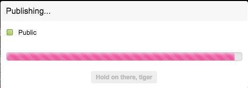
After some time, I warmed up and even contributed my own screenshot: a loading bar from Flickr that said “Hold on there, tiger.” I was starting to get it.
As I learned more about UX writing and started to work on projects through companies that took a chance on me, I found that I liked working on products, rather than just writing about them. I liked piecing together journeys for users—and I really liked working with product managers and designers.
But, a confession: In my eight(ish) years in the field, I’ve never fully warmed up to the cutesy, clever interface copy. I can’t stand confirm-shaming.
In retrospect, eight years ago, cleverness and personality made a lot of sense. It was the exact antidote we needed to decades of interfaces that sounded like developer-engineer robots and spoke to us as if we were developer-engineer robots, too. That type of copy showed us that products could be “human,” and that we could understand them.
But as more and more digital products are developed and used, I’ve been happy to see the pendulum gradually swinging back, away from cute copy to more neutral language—404 pages that help you get back, success messages that are celebratory without being cloying.
Given where we are in the evolution of products, here are three reasons why I think we need to stop trying to make every product the class clown or your best friend:
1. It’s exhausting.
Think about how many different products you use every day—the banking app, the email platform, the dashboards you use at work, the app for sending friends money or ordering dinner, the game you play on your commute… It’s hard to remember life without a lot of those apps.
Now think about what it would be like if every. single. one. of. them was constantly trying to make you laugh or get you to say, “Heh, that was clever.” It would get annoying really fast. You’d want to turn that feature off pretty much immediately.
One of the beauties of good UX writing (and good UX, as a whole) is that it’s seamless. It goes unnoticed. It lets us do what we need to do without thinking too hard. And if everything is a joke or a pun or something witty, we’re probably going to end up thinking more than we have to (or want to). Our brains need a break. Straightforward UX copy gives it to us.
2. It’s not inclusive.
That joke that you think is pretty funny—does it come at the expense of someone else? Most jokes make fun of people, for their race, gender, class, appearance, and so on. Those jokes don’t belong in products.
But even copy that isn’t a prejudiced, insulting joke can fall flat. Slang can be very age or location specific. Idioms may be hard to understand for people who aren’t fluent in the language in which the product is written (not to mention complicate localization efforts) or who have low literacy or cognitive disabilities. All of these can get in the way of clarity and hamper the user’s experience.
3. We can’t all be cool.
I recently saw a post on LinkedIn that called out B2B SaaS companies for designing all their websites to look the same—a cartoon-style drawing in the hero (top) section with blue/purple buttons. Similarly, for a while, it seemed like every product wanted to be “cool.” If Slack could do it, why couldn’t everyone else? But we’re not all cool in real life, and if that’s not your brand or what speaks to your users, it’s time to stop forcing it.
In defining voice and tone and writing for a product, it sometimes feels like the only choice you have is “Serious vs. Fun” or “Formal vs. Informal,” but “fun” or “cool” isn’t the only personality option products can take on. Your product tone can be helpful, inspiring, encouraging, and more. And “fun” doesn’t equal “user friendly”—you can be the latter without being the former.
Over the past eight years, it’s been a wild ride seeing people push the limits with their UX copy. But I’m glad to see that the winds are blowing back and the conversation is shifting back to clarity, inclusivity, and accessibility. And on a personal level, I’m glad I can save my comedienne skills for my family and friends.
Interested in taking a deep dive into how to write product copy that drives amazing user experiences? Join the waitlist for UX to Success, my program for people looking to break into freelance UX writing.


